CLINICIAN DASHBOARD FOR MENSTRUAL HEALTH
Designing a data-driven interface that helps clinicians interpret longitudinal cycle data — fast, clearly, and clinically.
Year :
2026
Industry :
Health Care
Tools :
Figma-Claude-UX Magic
Project Duration :
3 days

Problem :
Clinicians reviewing menstrual health data today face a fragmented and cognitively demanding experience. Raw cycle data — temperatures, hormone levels, pain scores, bleeding patterns, energy readings — is typically presented in tabular form or across disconnected charts, forcing the clinician to mentally stitch together patterns that should be immediately visible.
In a consultation setting where time is limited, this friction is not just inconvenient — it directly impacts the quality of clinical interpretation. There was no unified interface that could surface the full picture of a patient's 28-day cycle at a glance, highlight clinically significant events like ovulation, and reduce the interpretive load on the clinician without sacrificing data depth.

Solution :
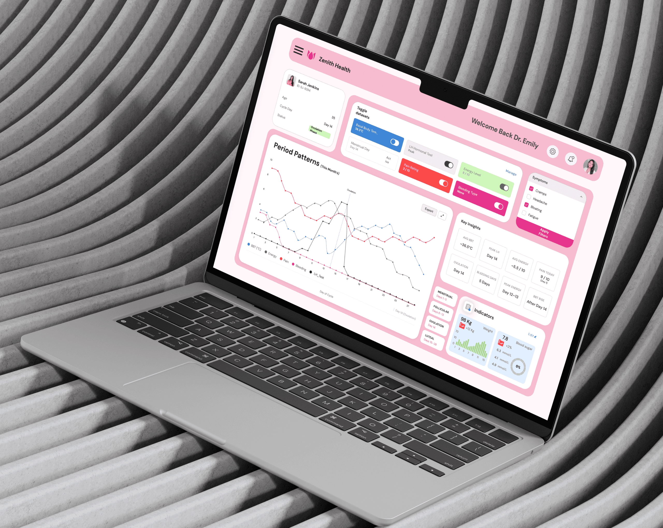
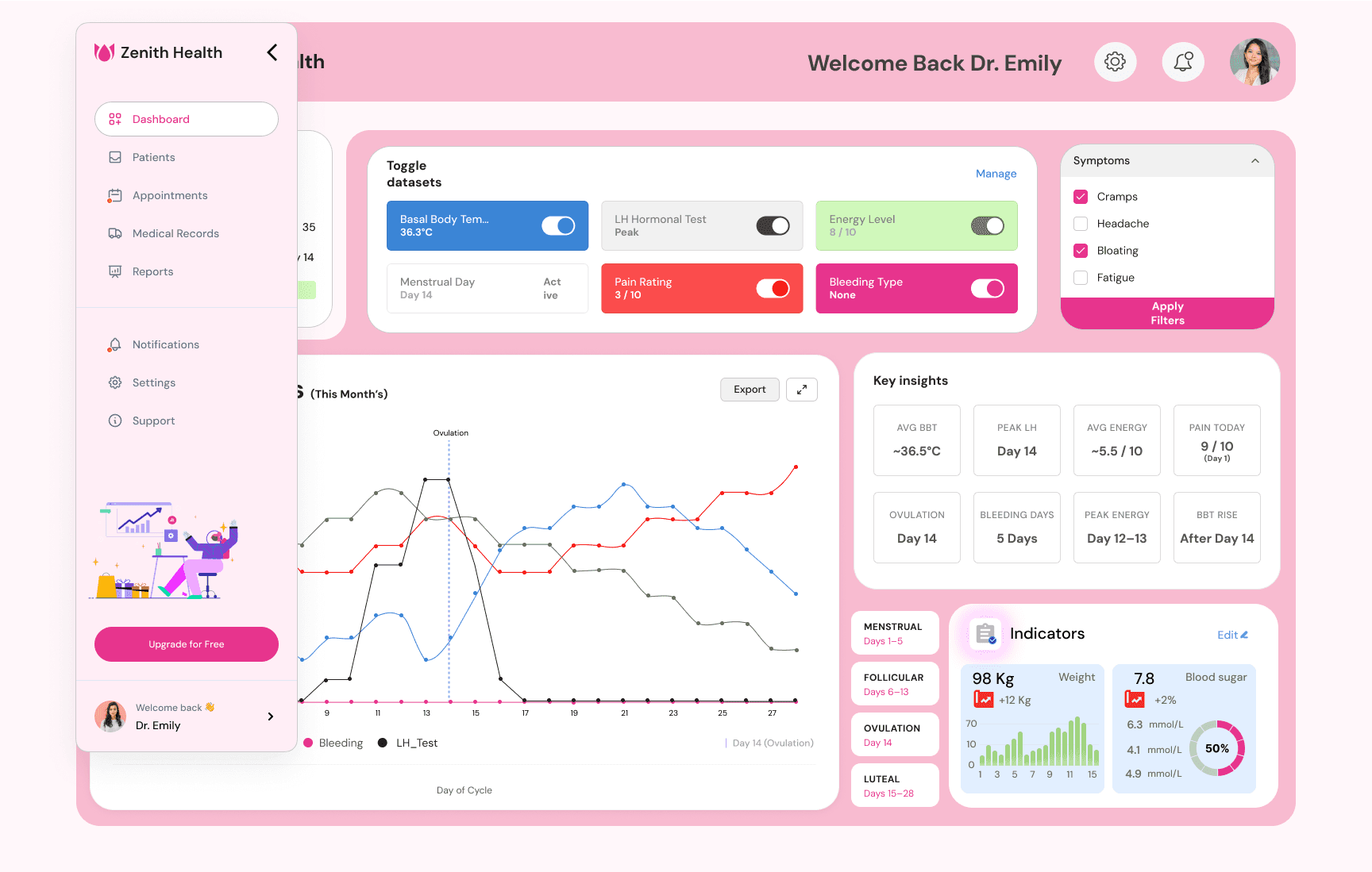
The Zenith Health Clinician Dashboard brings all six cycle variables into a single coherent view built around how clinicians actually think.
A multi-line time-series chart forms the core, with phase-colored background bands and a persistent ovulation marker keeping the clinician spatially oriented throughout the cycle. Color encoding is semantic — blue for BBT, green for energy, red for pain — so the chart communicates meaning without a legend scan.
Dataset toggles allow signal isolation without leaving the view, while a pre-computed Key Insights grid surfaces derived clinical values like average BBT, peak LH day, and bleeding duration, eliminating mental arithmetic mid-consultation. The patient card anchors cycle day and current phase at a glance. Every component serves one principle: reduce the distance between data and clinical decision.

Summary :
This project was a 3-day design sprint for Ona Wave Medical's UI/UX internship assignment. Starting from a raw 28-day dataset and an open-ended brief, the work involved clinical domain research, information architecture planning, low-fidelity wireframing, and a full high-fidelity Figma dashboard — all grounded in the goal of enabling fast, accurate clinical interpretation.
The result is a dashboard that prioritizes depth of thinking over visual decoration, combining appropriate chart types, semantic color encoding, and pre-computed insights to give clinicians a tool that works the way they think.
Click the Figma icon in the footer to explore all projects and view detailed case studies. 👇
More Projects


CLINICIAN DASHBOARD FOR MENSTRUAL HEALTH
Designing a data-driven interface that helps clinicians interpret longitudinal cycle data — fast, clearly, and clinically.
Year :
2026
Industry :
Health Care
Tools :
Figma-Claude-UX Magic
Project Duration :
3 days
Problem :
Clinicians reviewing menstrual health data today face a fragmented and cognitively demanding experience. Raw cycle data — temperatures, hormone levels, pain scores, bleeding patterns, energy readings — is typically presented in tabular form or across disconnected charts, forcing the clinician to mentally stitch together patterns that should be immediately visible.
In a consultation setting where time is limited, this friction is not just inconvenient — it directly impacts the quality of clinical interpretation. There was no unified interface that could surface the full picture of a patient's 28-day cycle at a glance, highlight clinically significant events like ovulation, and reduce the interpretive load on the clinician without sacrificing data depth.
Solution :
The Zenith Health Clinician Dashboard brings all six cycle variables into a single coherent view built around how clinicians actually think.
A multi-line time-series chart forms the core, with phase-colored background bands and a persistent ovulation marker keeping the clinician spatially oriented throughout the cycle. Color encoding is semantic — blue for BBT, green for energy, red for pain — so the chart communicates meaning without a legend scan.
Dataset toggles allow signal isolation without leaving the view, while a pre-computed Key Insights grid surfaces derived clinical values like average BBT, peak LH day, and bleeding duration, eliminating mental arithmetic mid-consultation. The patient card anchors cycle day and current phase at a glance. Every component serves one principle: reduce the distance between data and clinical decision.
Summary :
This project was a 3-day design sprint for Ona Wave Medical's UI/UX internship assignment. Starting from a raw 28-day dataset and an open-ended brief, the work involved clinical domain research, information architecture planning, low-fidelity wireframing, and a full high-fidelity Figma dashboard — all grounded in the goal of enabling fast, accurate clinical interpretation.
The result is a dashboard that prioritizes depth of thinking over visual decoration, combining appropriate chart types, semantic color encoding, and pre-computed insights to give clinicians a tool that works the way they think.
Click the Figma icon in the footer to explore all projects and view detailed case studies. 👇
More Projects
CLINICIAN DASHBOARD FOR MENSTRUAL HEALTH
Designing a data-driven interface that helps clinicians interpret longitudinal cycle data — fast, clearly, and clinically.
Year :
2026
Industry :
Health Care
Tools :
Figma-Claude-UX Magic
Project Duration :
3 days
Problem :
Clinicians reviewing menstrual health data today face a fragmented and cognitively demanding experience. Raw cycle data — temperatures, hormone levels, pain scores, bleeding patterns, energy readings — is typically presented in tabular form or across disconnected charts, forcing the clinician to mentally stitch together patterns that should be immediately visible.
In a consultation setting where time is limited, this friction is not just inconvenient — it directly impacts the quality of clinical interpretation. There was no unified interface that could surface the full picture of a patient's 28-day cycle at a glance, highlight clinically significant events like ovulation, and reduce the interpretive load on the clinician without sacrificing data depth.
Solution :
The Zenith Health Clinician Dashboard brings all six cycle variables into a single coherent view built around how clinicians actually think.
A multi-line time-series chart forms the core, with phase-colored background bands and a persistent ovulation marker keeping the clinician spatially oriented throughout the cycle. Color encoding is semantic — blue for BBT, green for energy, red for pain — so the chart communicates meaning without a legend scan.
Dataset toggles allow signal isolation without leaving the view, while a pre-computed Key Insights grid surfaces derived clinical values like average BBT, peak LH day, and bleeding duration, eliminating mental arithmetic mid-consultation. The patient card anchors cycle day and current phase at a glance. Every component serves one principle: reduce the distance between data and clinical decision.
Summary :
This project was a 3-day design sprint for Ona Wave Medical's UI/UX internship assignment. Starting from a raw 28-day dataset and an open-ended brief, the work involved clinical domain research, information architecture planning, low-fidelity wireframing, and a full high-fidelity Figma dashboard — all grounded in the goal of enabling fast, accurate clinical interpretation.
The result is a dashboard that prioritizes depth of thinking over visual decoration, combining appropriate chart types, semantic color encoding, and pre-computed insights to give clinicians a tool that works the way they think.
Click the Figma icon in the footer to explore all projects and view detailed case studies. 👇