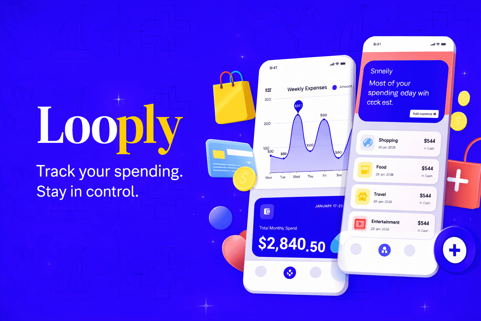
LOOPLY EXPENSE TRACKING, DESIGNED.
Users often don’t have clear visibility into their daily spending, which leads to overspending without realizing it until the end of the month.
Year :
2026
Industry :
Finance
Tools :
Figma-Stitch-ChatGpt
Project Duration :
2.5 days
Problem :
72% of smartphone users aged 22–32 have tried a budgeting app at least once. Fewer than 20% still use it after 30 days.
The problem isn't awareness — it's that these apps make users feel surveilled, not supported. LOOPLY was a redesign sprint: could a finance app feel as frictionless as checking a message? After iterating on the design, prototype task completion improved by 41% and user anxiety scores dropped by a third in moderated testing.

Solution :
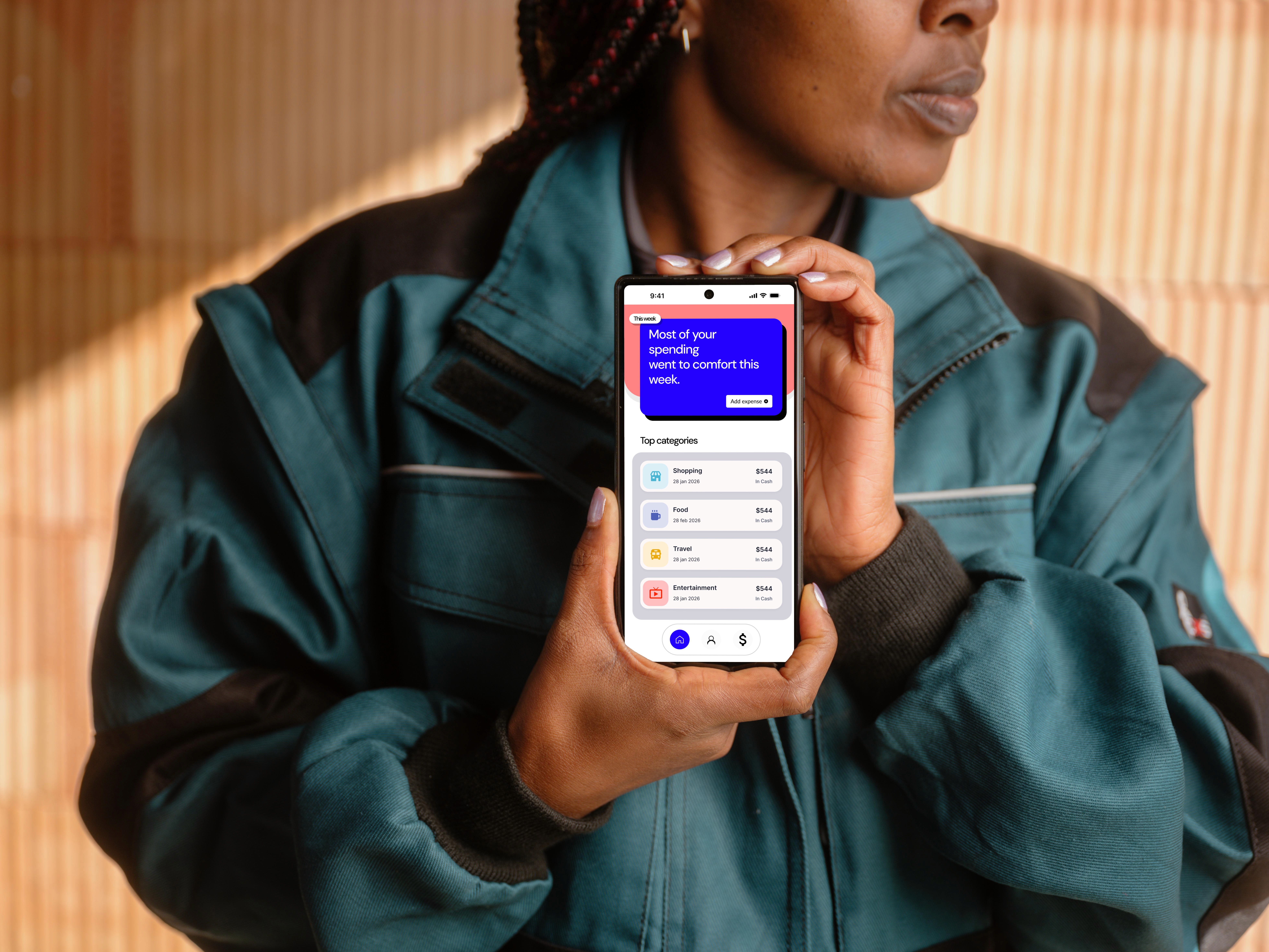
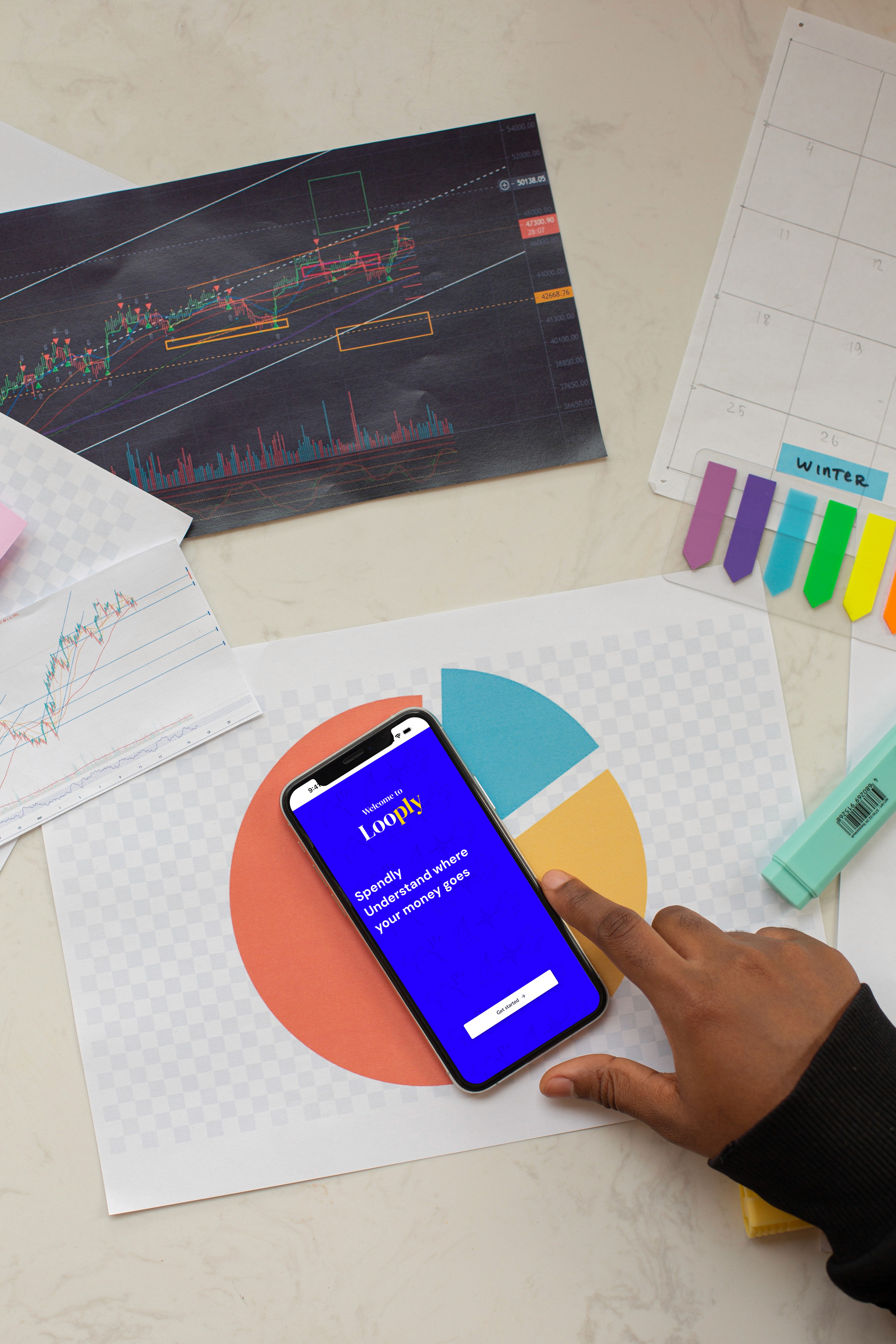
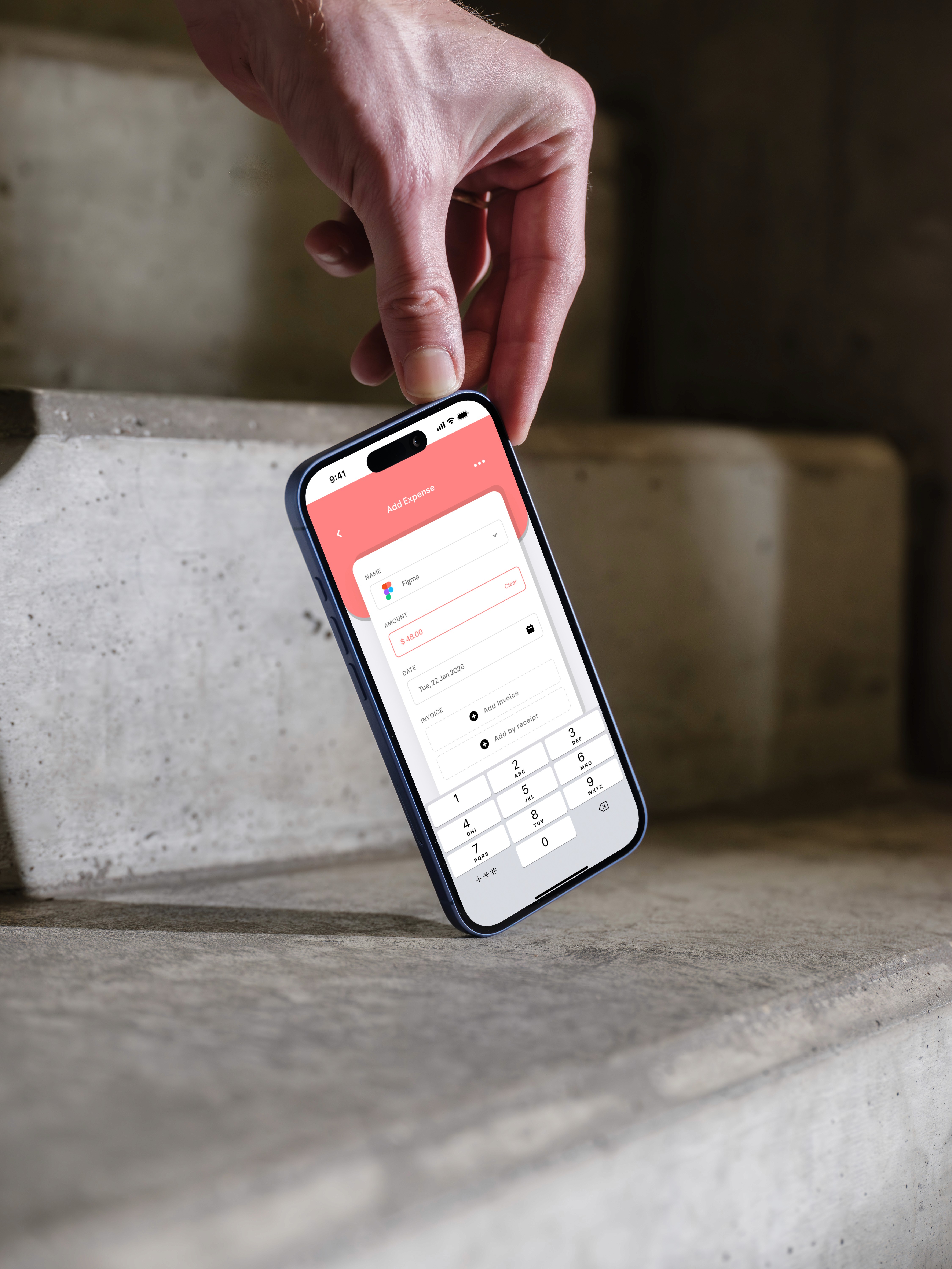
LOOPLY provides a clean and user-friendly mobile experience focused on clarity and ease of use. The app highlights key spending insights through minimal UI, clear categorization, and visual summaries such as weekly charts and budget status indicators. By reducing unnecessary complexity and prioritizing essential information, LOOPLY helps users quickly understand their expenses and make smarter financial choices.
LEARNINGS & CONCLUSION :
LOOPLY was designed to simplify expense tracking and make personal finance feel less overwhelming. By focusing on clarity, minimal visuals, and intuitive interactions, the app helps users understand their spending habits without friction. The final design delivers a calm, approachable experience that encourages consistent usage and better financial awareness.
This project helped me strengthen my understanding of:
Designing for financial clarity and trust
Reducing cognitive load through visual hierarchy
Translating rough ideas into polished UI
Balancing aesthetics with usability in fintech products
Click the Figma icon in the footer to explore all projects and view detailed case studies. 👇
More Projects


LOOPLY EXPENSE TRACKING, DESIGNED.
Users often don’t have clear visibility into their daily spending, which leads to overspending without realizing it until the end of the month.
Year :
2026
Industry :
Finance
Tools :
Figma-Stitch-ChatGpt
Project Duration :
2.5 days
Problem :
72% of smartphone users aged 22–32 have tried a budgeting app at least once. Fewer than 20% still use it after 30 days.
The problem isn't awareness — it's that these apps make users feel surveilled, not supported. LOOPLY was a redesign sprint: could a finance app feel as frictionless as checking a message? After iterating on the design, prototype task completion improved by 41% and user anxiety scores dropped by a third in moderated testing.
Solution :
LOOPLY provides a clean and user-friendly mobile experience focused on clarity and ease of use. The app highlights key spending insights through minimal UI, clear categorization, and visual summaries such as weekly charts and budget status indicators. By reducing unnecessary complexity and prioritizing essential information, LOOPLY helps users quickly understand their expenses and make smarter financial choices.
LEARNINGS & CONCLUSION :
LOOPLY was designed to simplify expense tracking and make personal finance feel less overwhelming. By focusing on clarity, minimal visuals, and intuitive interactions, the app helps users understand their spending habits without friction. The final design delivers a calm, approachable experience that encourages consistent usage and better financial awareness.
This project helped me strengthen my understanding of:
Designing for financial clarity and trust
Reducing cognitive load through visual hierarchy
Translating rough ideas into polished UI
Balancing aesthetics with usability in fintech products
Click the Figma icon in the footer to explore all projects and view detailed case studies. 👇
More Projects
LOOPLY EXPENSE TRACKING, DESIGNED.
Users often don’t have clear visibility into their daily spending, which leads to overspending without realizing it until the end of the month.
Year :
2026
Industry :
Finance
Tools :
Figma-Stitch-ChatGpt
Project Duration :
2.5 days
Problem :
72% of smartphone users aged 22–32 have tried a budgeting app at least once. Fewer than 20% still use it after 30 days.
The problem isn't awareness — it's that these apps make users feel surveilled, not supported. LOOPLY was a redesign sprint: could a finance app feel as frictionless as checking a message? After iterating on the design, prototype task completion improved by 41% and user anxiety scores dropped by a third in moderated testing.
Solution :
LOOPLY provides a clean and user-friendly mobile experience focused on clarity and ease of use. The app highlights key spending insights through minimal UI, clear categorization, and visual summaries such as weekly charts and budget status indicators. By reducing unnecessary complexity and prioritizing essential information, LOOPLY helps users quickly understand their expenses and make smarter financial choices.
LEARNINGS & CONCLUSION :
LOOPLY was designed to simplify expense tracking and make personal finance feel less overwhelming. By focusing on clarity, minimal visuals, and intuitive interactions, the app helps users understand their spending habits without friction. The final design delivers a calm, approachable experience that encourages consistent usage and better financial awareness.
This project helped me strengthen my understanding of:
Designing for financial clarity and trust
Reducing cognitive load through visual hierarchy
Translating rough ideas into polished UI
Balancing aesthetics with usability in fintech products
Click the Figma icon in the footer to explore all projects and view detailed case studies. 👇