LUMIA BEAUTY DESIGN
A e-commerce homepage for a beauty and skincare brand — designed with a clean visual system, intuitive UX patterns, and a warm, approachable aesthetic.
Year :
2025
Industry :
Skin Care
Tools :
Figma-Chatgpt-Pexels
Project Duration :
2 days

Problem :
Beauty e-commerce homepages often sacrifice usability for aesthetics — or conversion for brand feel. The challenge was to design a homepage that resolves this tension:
how do you create an experience that feels premium and emotionally resonant, while making product discovery fast and frictionless for a first-time visitor?
Solution :
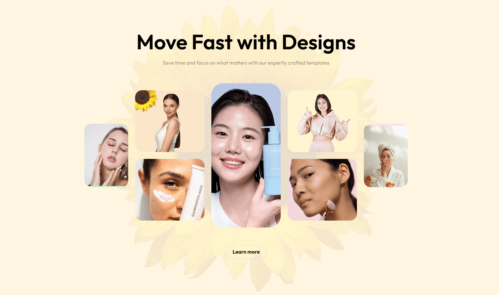
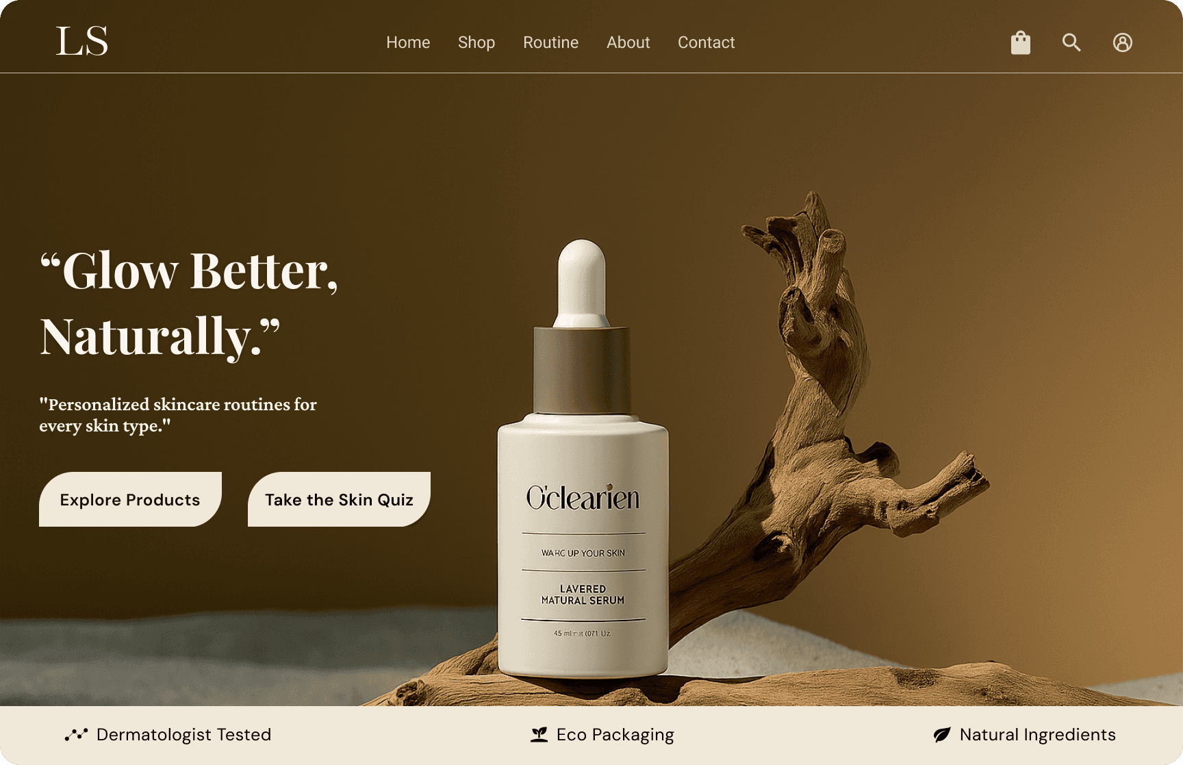
To solve this, the design prioritises immediate clarity over visual complexity. A trust signal in the hero removes hesitation before the user has even scrolled. Navigation is kept to its bare minimum so users are never overwhelmed by choices at the top of the page.
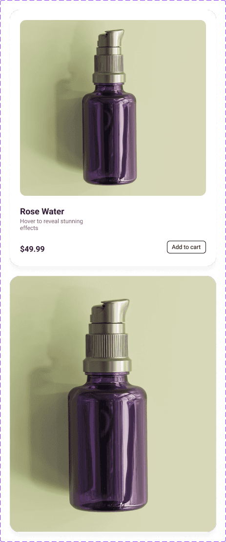
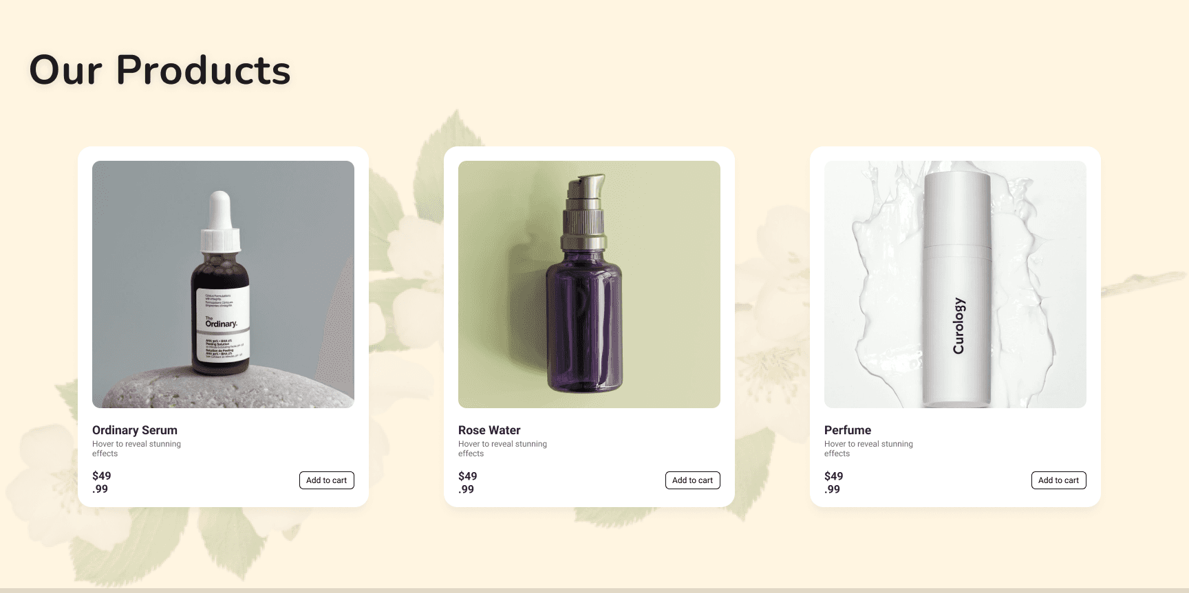
Products are surfaced immediately — no clicking, no hunting — with everything needed to make a quick decision visible at a glance. Categories are scannable and visual, so users who don't know exactly what they want can orient themselves instantly.
Summary :
Lumia is a responsive beauty e-commerce homepage that bridges visual appeal and usability. By applying strong design fundamentals — clear hierarchy, consistent components, and a warm but structured visual system — the project demonstrates how a homepage can function as both a brand statement and a genuine conversion tool, guiding first-time visitors from emotional engagement to confident product exploration with minimal friction
Click the Figma icon in the footer to explore all projects and view detailed case studies. 👇
More Projects


LUMIA BEAUTY DESIGN
A e-commerce homepage for a beauty and skincare brand — designed with a clean visual system, intuitive UX patterns, and a warm, approachable aesthetic.
Year :
2025
Industry :
Skin Care
Tools :
Figma-Chatgpt-Pexels
Project Duration :
2 days
Problem :
Beauty e-commerce homepages often sacrifice usability for aesthetics — or conversion for brand feel. The challenge was to design a homepage that resolves this tension:
how do you create an experience that feels premium and emotionally resonant, while making product discovery fast and frictionless for a first-time visitor?
Solution :
To solve this, the design prioritises immediate clarity over visual complexity. A trust signal in the hero removes hesitation before the user has even scrolled. Navigation is kept to its bare minimum so users are never overwhelmed by choices at the top of the page.
Products are surfaced immediately — no clicking, no hunting — with everything needed to make a quick decision visible at a glance. Categories are scannable and visual, so users who don't know exactly what they want can orient themselves instantly.
Summary :
Lumia is a responsive beauty e-commerce homepage that bridges visual appeal and usability. By applying strong design fundamentals — clear hierarchy, consistent components, and a warm but structured visual system — the project demonstrates how a homepage can function as both a brand statement and a genuine conversion tool, guiding first-time visitors from emotional engagement to confident product exploration with minimal friction
Click the Figma icon in the footer to explore all projects and view detailed case studies. 👇
More Projects
LUMIA BEAUTY DESIGN
A e-commerce homepage for a beauty and skincare brand — designed with a clean visual system, intuitive UX patterns, and a warm, approachable aesthetic.
Year :
2025
Industry :
Skin Care
Tools :
Figma-Chatgpt-Pexels
Project Duration :
2 days
Problem :
Beauty e-commerce homepages often sacrifice usability for aesthetics — or conversion for brand feel. The challenge was to design a homepage that resolves this tension:
how do you create an experience that feels premium and emotionally resonant, while making product discovery fast and frictionless for a first-time visitor?
Solution :
To solve this, the design prioritises immediate clarity over visual complexity. A trust signal in the hero removes hesitation before the user has even scrolled. Navigation is kept to its bare minimum so users are never overwhelmed by choices at the top of the page.
Products are surfaced immediately — no clicking, no hunting — with everything needed to make a quick decision visible at a glance. Categories are scannable and visual, so users who don't know exactly what they want can orient themselves instantly.
Summary :
Lumia is a responsive beauty e-commerce homepage that bridges visual appeal and usability. By applying strong design fundamentals — clear hierarchy, consistent components, and a warm but structured visual system — the project demonstrates how a homepage can function as both a brand statement and a genuine conversion tool, guiding first-time visitors from emotional engagement to confident product exploration with minimal friction
Click the Figma icon in the footer to explore all projects and view detailed case studies. 👇