DUOLINGO'S ONBOARDING OVERLOAD
Let Users feel progress in the first 3 minutes, before asking anything of them.
Year :
2026
Industry :
Education
Tools :
Figma-Claude
Project Duration :
2 days

Problem :
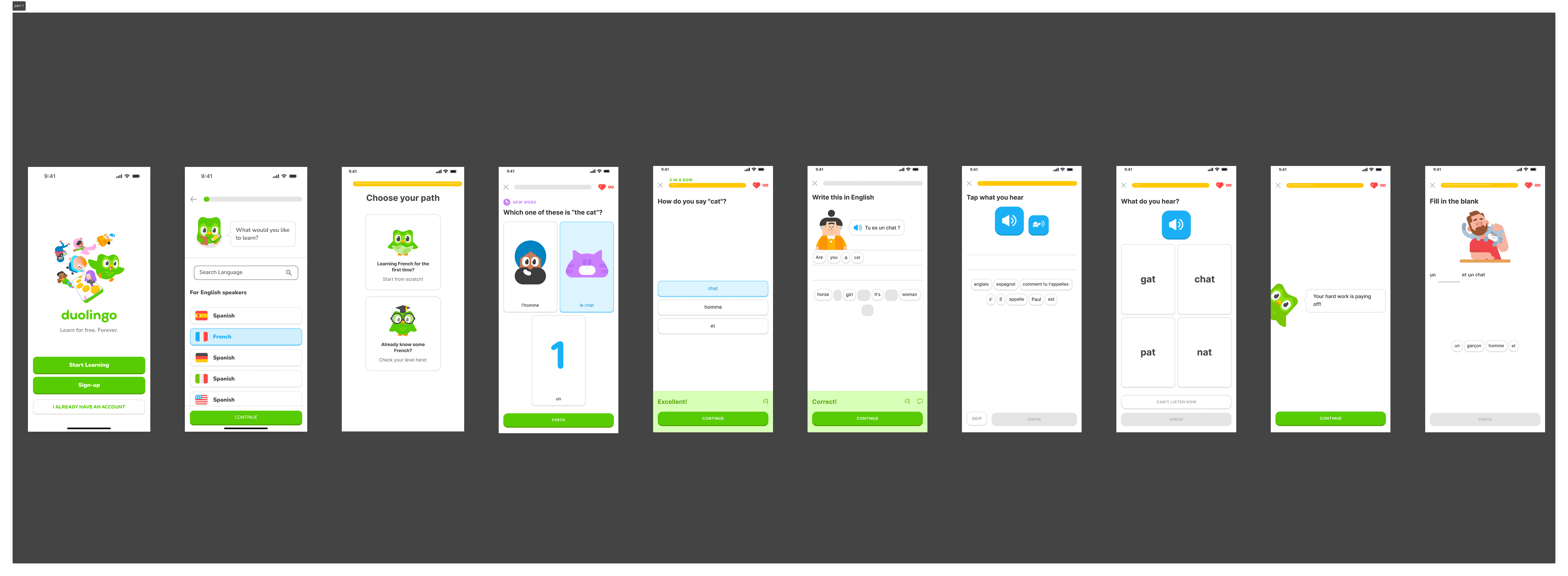
Duolingo's onboarding flow front-loads too many decisions before a new user ever experiences the product. Upon first launch, users are asked to set a daily learning goal, select a language from a long list, and optionally take a placement test — all before completing a single lesson.
This sequence puts configuration before value, asking users to commit to a product they haven't yet had a reason to trust. The result is a high drop-off rate in the critical first three minutes, when user motivation is at its peak but patience is razor thin.

Solution :
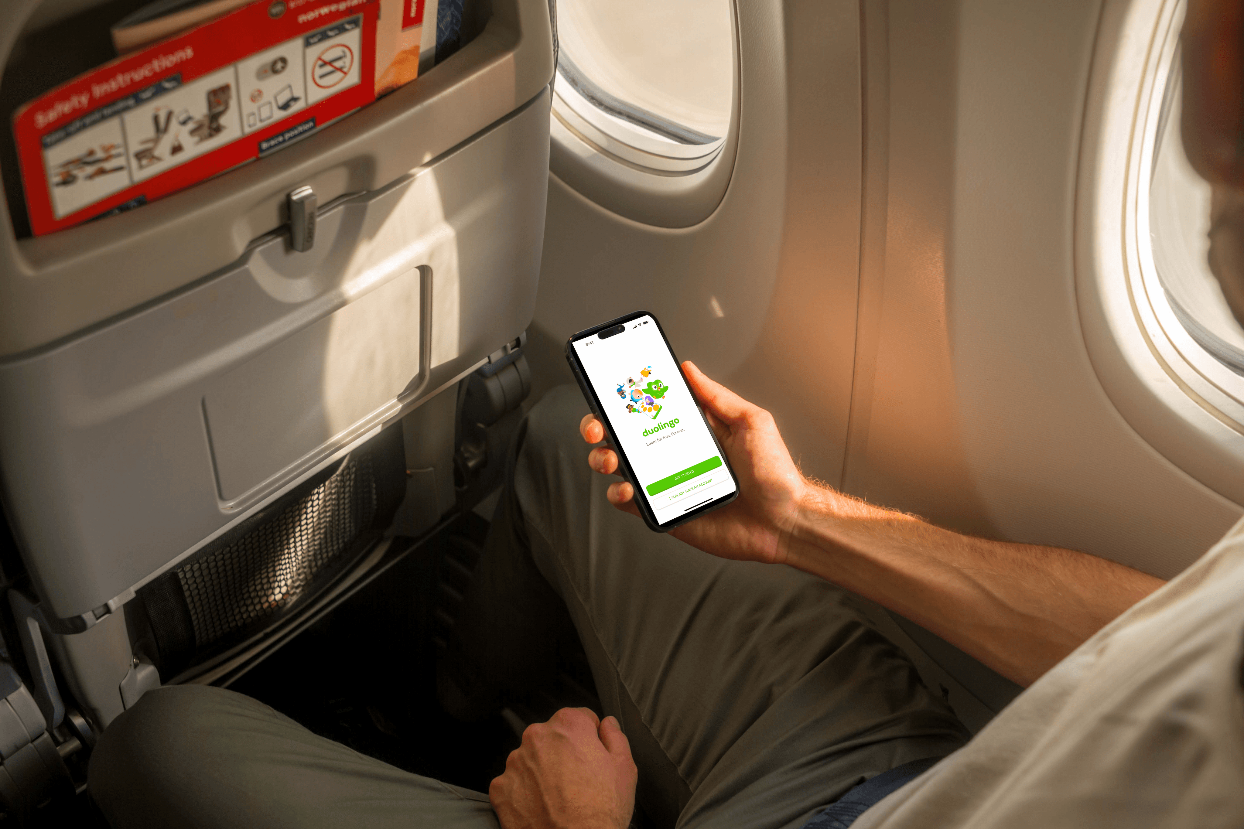
The redesign flips the sequence entirely — lead with the experience, follow with the setup. The entry screen is simplified to give users a direct path into learning with no sign-up wall blocking them. From there, users are dropped straight into a short three-question micro-lesson that they can complete in under ninety seconds.
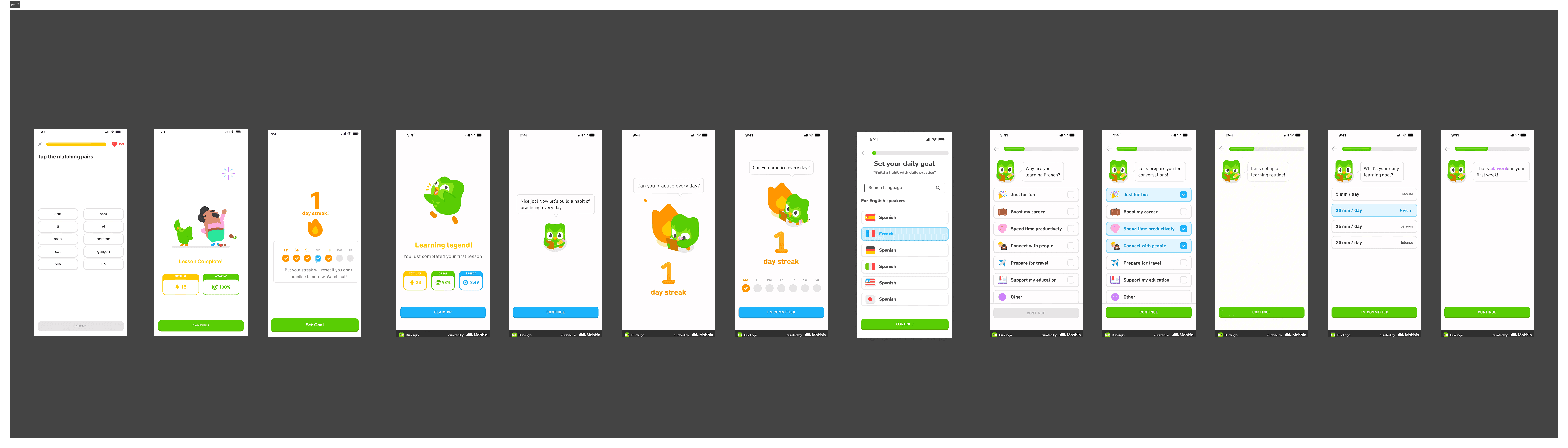
Only after they've answered questions, received positive feedback, and earned their first XP and streak does the app ask anything of them. Language selection and goal setting are deferred to this post-lesson moment, when the user is emotionally invested and has something worth building on. Sign-up is framed as "save your progress" rather than a mandatory gate — making account creation feel like a natural next step rather than an obstacle.

Summary :
This project is a conceptual redesign of Duolingo's first-time user experience, built around one core principle: value before commitment. The original flow asks users to make multiple configuration decisions before they've experienced a single moment of the product, creating unnecessary friction at the most fragile point of the user journey. The redesign restructures these three minutes so that the product proves itself first.
A simplified entry screen leads directly into an immediate micro-lesson, followed by a reward moment, and only then into language selection and goal setting. Every screen earns its place by either delivering value or deepening the user's investment in continuing. The result is an onboarding flow that respects the user's time, builds momentum from the very first tap, and sets the foundation for the daily habit Duolingo is designed to create.
Click the Figma icon in the footer to explore all projects and view detailed case studies. 👇
More Projects


DUOLINGO'S ONBOARDING OVERLOAD
Let Users feel progress in the first 3 minutes, before asking anything of them.
Year :
2026
Industry :
Education
Tools :
Figma-Claude
Project Duration :
2 days
Problem :
Duolingo's onboarding flow front-loads too many decisions before a new user ever experiences the product. Upon first launch, users are asked to set a daily learning goal, select a language from a long list, and optionally take a placement test — all before completing a single lesson.
This sequence puts configuration before value, asking users to commit to a product they haven't yet had a reason to trust. The result is a high drop-off rate in the critical first three minutes, when user motivation is at its peak but patience is razor thin.
Solution :
The redesign flips the sequence entirely — lead with the experience, follow with the setup. The entry screen is simplified to give users a direct path into learning with no sign-up wall blocking them. From there, users are dropped straight into a short three-question micro-lesson that they can complete in under ninety seconds.
Only after they've answered questions, received positive feedback, and earned their first XP and streak does the app ask anything of them. Language selection and goal setting are deferred to this post-lesson moment, when the user is emotionally invested and has something worth building on. Sign-up is framed as "save your progress" rather than a mandatory gate — making account creation feel like a natural next step rather than an obstacle.
Summary :
This project is a conceptual redesign of Duolingo's first-time user experience, built around one core principle: value before commitment. The original flow asks users to make multiple configuration decisions before they've experienced a single moment of the product, creating unnecessary friction at the most fragile point of the user journey. The redesign restructures these three minutes so that the product proves itself first.
A simplified entry screen leads directly into an immediate micro-lesson, followed by a reward moment, and only then into language selection and goal setting. Every screen earns its place by either delivering value or deepening the user's investment in continuing. The result is an onboarding flow that respects the user's time, builds momentum from the very first tap, and sets the foundation for the daily habit Duolingo is designed to create.
Click the Figma icon in the footer to explore all projects and view detailed case studies. 👇
More Projects
DUOLINGO'S ONBOARDING OVERLOAD
Let Users feel progress in the first 3 minutes, before asking anything of them.
Year :
2026
Industry :
Education
Tools :
Figma-Claude
Project Duration :
2 days
Problem :
Duolingo's onboarding flow front-loads too many decisions before a new user ever experiences the product. Upon first launch, users are asked to set a daily learning goal, select a language from a long list, and optionally take a placement test — all before completing a single lesson.
This sequence puts configuration before value, asking users to commit to a product they haven't yet had a reason to trust. The result is a high drop-off rate in the critical first three minutes, when user motivation is at its peak but patience is razor thin.
Solution :
The redesign flips the sequence entirely — lead with the experience, follow with the setup. The entry screen is simplified to give users a direct path into learning with no sign-up wall blocking them. From there, users are dropped straight into a short three-question micro-lesson that they can complete in under ninety seconds.
Only after they've answered questions, received positive feedback, and earned their first XP and streak does the app ask anything of them. Language selection and goal setting are deferred to this post-lesson moment, when the user is emotionally invested and has something worth building on. Sign-up is framed as "save your progress" rather than a mandatory gate — making account creation feel like a natural next step rather than an obstacle.
Summary :
This project is a conceptual redesign of Duolingo's first-time user experience, built around one core principle: value before commitment. The original flow asks users to make multiple configuration decisions before they've experienced a single moment of the product, creating unnecessary friction at the most fragile point of the user journey. The redesign restructures these three minutes so that the product proves itself first.
A simplified entry screen leads directly into an immediate micro-lesson, followed by a reward moment, and only then into language selection and goal setting. Every screen earns its place by either delivering value or deepening the user's investment in continuing. The result is an onboarding flow that respects the user's time, builds momentum from the very first tap, and sets the foundation for the daily habit Duolingo is designed to create.
Click the Figma icon in the footer to explore all projects and view detailed case studies. 👇